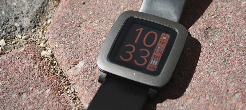
Wristwatches reflect the wearer’s style, and wearables are no different. TimeStyle provides a readable and customizable time display, designed to blend with the watch’s design language. With nearly 200,000 users and over 14,000 “hearts”, it is the third most popular watchface ever made for the Pebble smartwatch, which recently has been revived after a long absense!
Introduction
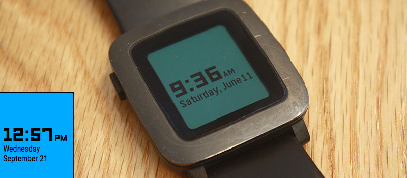
When I got a Pebble smartwatch, I admired the watch’s visual aesthetic; inspired by late 1960s-era pop art, it complemented the watch’s hardware, 64-color reflective display1.
However, I found that while there were thousands of watch faces available for the watch (many of them quite lovely), there were two key issues:
-
They did not match the visual language used in the rest of the watch’s software
-
They may not necessarily have exactly the information I wanted
For example, a face might have a beautiful time display, but lack the current temperature outside. Similarly, a face might include weather data, but lack today’s date. In the end, what I wanted wasn’t something unique that would make any kind of statement; I simply wanted something that would tell the time and some ancillary information; a default looking watch face.
As such, I took it upon myself to design the watch face that I felt should have been included by default.
Design
Initial Prototype
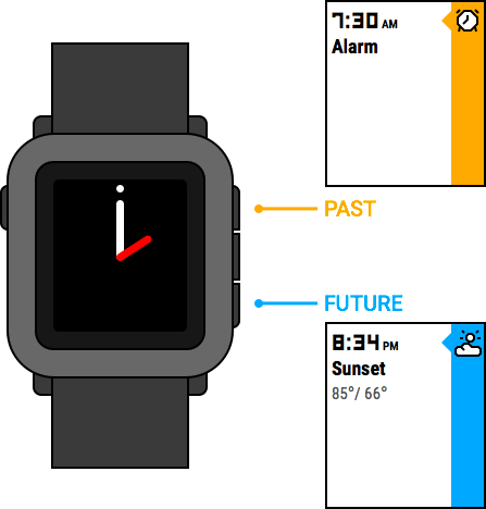
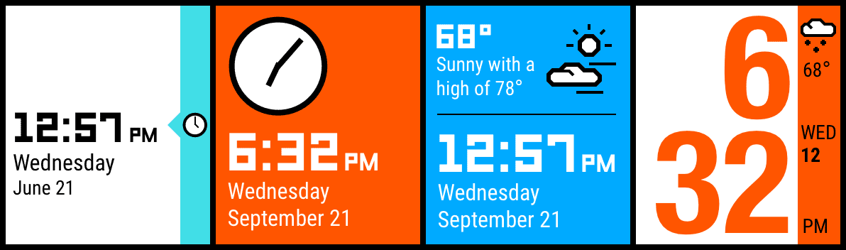
I began by examining the watch’s existing user interface elements to find good examples of how a matching watch face might look. As a basis, I decided to use the watch’s “Timeline” interface, which serves Pebble’s way of visualizing events in the past and future. I felt the Timeline was particularly well-suited as inspiration due to its proximity to the watch face; visually, the currently selected watch face is designed to act as the “present” to complement the Timeline’s “past” and “future” views:
Based on this, I quickly sketched a basic watchface resembling the the most basic from of the timeline: the LECO font paired with a smaller san-serif on a solid colored background. However, given the watch’s unique hardware, I realized that my mockups did not accurately represent what the face would like to use. As such, I created rapid prototype of this style, installing it on my watch2:
After using this for several days, I determined there were two key factors that made this design problematic:
- The time was difficult to read in the dark
- The background colors, which looked so vivid in my designs, looked very washed out on the watch. With nothing but the time contrasting the colored background, the colors failed to look like much on the watch’s desaturated color display
I then iterated further, exploring concepts that I hoped would add some much-needed contrast to the design:
“Final” Concept, and Internet Feedback
While exploring a narrow-width font (Helvetica Neue Condensed, in this example) I came upon the the idea of using large, right-aligned digits against a timeline-style bar to show ancillary information. I felt this concept was worth more refinement, leading me to a final concept image:
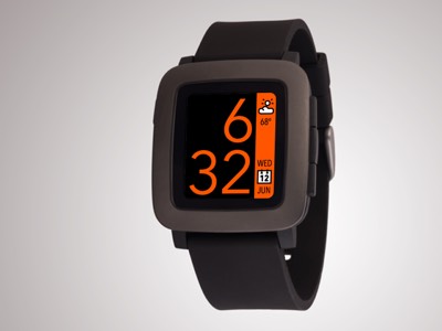
To gather some additional feedback, I posted this image to Dribbble and Reddit’s r/pebble. In addition to overwhelmingly positive feedback, there was a clear message: not everyone likes orange:
“…provide the option to change the colors”
“Make the colour configurable!”
“…add a setting page with the whole range of color the Pebble Time can display”
“chuck in customisable colours and this will become one of the best!”
“Blue would be welcome…maybe even purple”
Based on these requests, it was evident that customizability would be paramount.
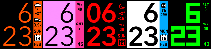
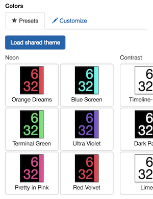
Many Pebble faces offer color customization, but due to the nature of the Pebble configuration system, most require that the user select colors, save and exit the settings page. If the user didn’t like the colors, they must go back into the settings page and choose another. Instead of this, I created a selection hand-picked color schemes that I tested on my own watch for readability. Each of these is previewed in the settings page so that one doesn’t have to go and commit to it before picking. In later versions, I would eventually add the ability to save, load, share, and suggest theme presets.
Feedback and Iteration
After publishing the face, it gained quite a bit of positive feedback, and quickly ascended through the Pebble Store charts. Adding color themes would prove worthwhile: according to my analytics data, more than 85% of users change their color theme at least once!
Adding “Complications”
However, as the user base increased, it became clear that simply offering customizable colors would not be sufficient to achieve my ideal: the “default” watch face that could serve as many people’s needs as possible. Requests included new font options (such as larger fonts for older users), new languages, and all sorts of data for the sidebar, such as battery level, weather forecasts, and even Swatch™ Internet Time3! As the number of options continued to expand, I realized that simply having switches for the different options not be sustainable. As a result, I added the ability for the sidebar to contain 3 different “complications”. In order to ensure that people could know what they were getting without leaving the settings page, I replicated the real-time preview of what the sidebar would look like:
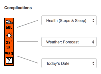
Building out a fully modular sidebar system proved an to be a worthwhile decision; when Pebble added a step and sleep tracking API, I quickly was able to add an option to show steps, without adding any additional complexity to the settings UI.
Support E-Mail Volume
One key metric that I would use to determine where to focus my development efforts was support e-mail volume. However, there was one email that I got more than any other:
“How can I make the watch show 24 hour time?”
This, however, had nothing to do with my watchface; 24-hour time is an option on the Pebble itself! However, many users apparently expected there to be an option here, and there simply wasn’t one. I even discussed this with other attendees at the 2015 Pebble Developer Retreat, and found that I was not the only one bombarded with this type of request; one developer I spoke with had even set up an automatic email responder for these requests! I wondered if there was a better way, so I tested an incredibly simple solution: I added a brief bit of help text to the settings page mentioning how to change your watch to 24 hour time–the emails essentially vanished!
Conclusion
While Pebble died a tragic Silicon Valley accquideath back in 2016, thanks to dedicated fans, a mirror of the Pebble app store nonetheless continued to function, where TimeStyle continued to accumulate installs, even slightly increasing its position on in the rankings! After the revival of Pebble, TimeStyle was even used in product renders for the new Pebble Time 2 smartwatch!
These results, I believe, indicate that my initial intuition was correct; the ideal watch face for the Pebble is a default-looking face coupled with a meticulous attention to detail and close attention to user feedback. By creating a simple, readable, and customizable watch face that matched the aesthetic of the watch, I achieved what I had set out to do: create the “default” digital watch face that I had wished my Pebble came with when I bought it.
TimeStyle has been featured in: