For this project, I worked with an international team to redesign Indeed’s internal taxonomy tool. After talking with the project manager, I used access logs to identify the top 10 users of the existing tool, and invited each of them to a research session, using semi-structured interview questions to determine likely pain points. I then worked with the engineer on the project to redesign the UI based on this feedback.
Pre-Redesign Version
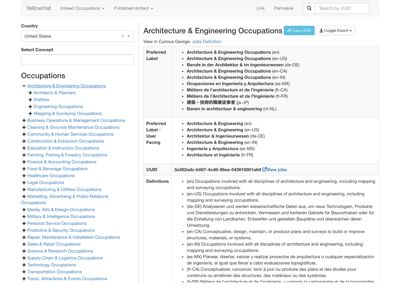
Emphasizing the identifier tag and adding a quick copy action
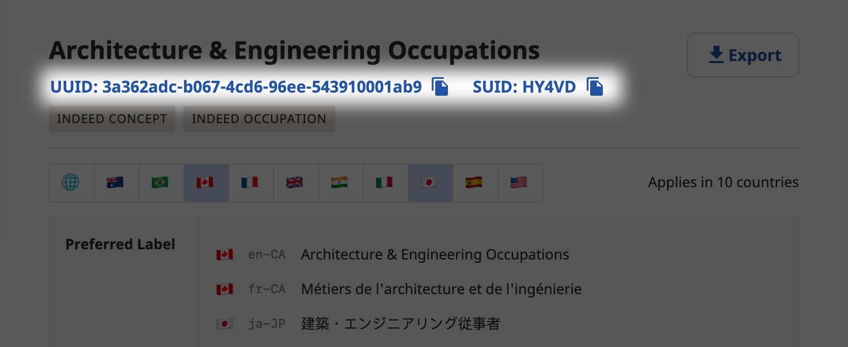
From interviewing users, it became apparently that the #1 thing anyone ever did with this tool was search for concepts and copy the “UUID” tag. However, in the original version, it was buried halfway down the page among a variety of other miscellaneous information. As such, I emphasized it in the UI and also added a quick copy to clipboard action that didn’t require text selection:
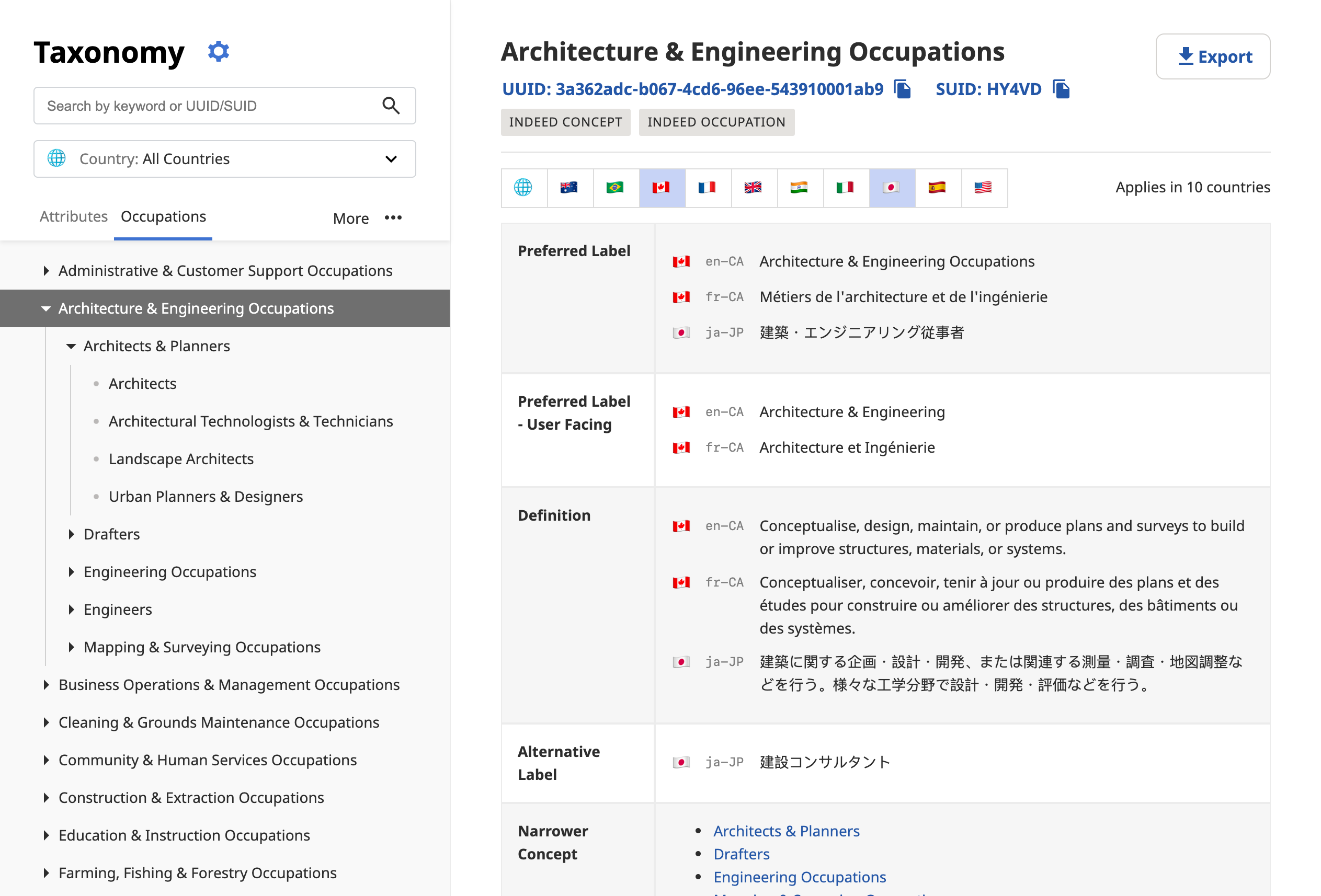
Global View & Language Filters
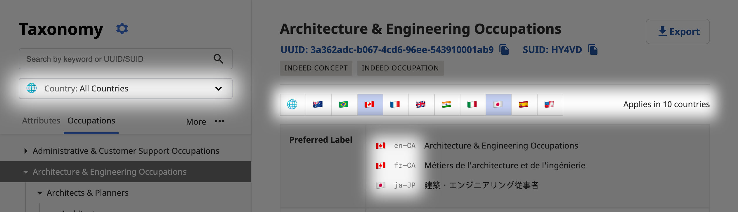
There exists a separate hierarchy for each region (US, Canada, etc). Therefore, in the prior version of the tool, it would simply select United States 🇺🇸 and show you the hierarchy for that region. While that sort of worked, it meant that in almost every view something would be hidden. One user noted frustration with having to “constantly switch between the US and Canada”.
A second issue was that each node in the hierarchy would contain localized strings for any number of languages/regions, all of which were visible at once. Some people did like this, but others felt that it created too much clutter, as they were only interested in one or two languages (typically related to whatever project they were working on at the moment).
As such, I worked with the team to create two key new features: a global view that showed a composite of all hierarchies, and the ability to select one or more the languages to be shown (instead of just showing all of them).
“I’m liking it so far. Browsing all countries then using the flag/country filter is a useful combination”
― Random person on Slack