- Introduction
- Research and Data Analysis
- Information Architecture and Flows
- Wireframing
- Defining the Visual Appearance
- Conclusions and Future Work
Introduction
In use at over 7,000 restaurants worldwide, the Restaurant Management System was an unqualified success. However, as it had grown in popularity, it had also grown in features, slowly evolving into sprawling mess of interconnected pages.
Redesigning such a system from the ground up would be no easy task, so we decided to team up with an external team of usability professionals with experience in the industry.
Research and Data Analysis
Before design of the new system could begin, we undertook a project to understand the existing system in detail. Starting with an expert review of the existing system and continuing into interviews with both users and stakeholders, our team produced several documents.
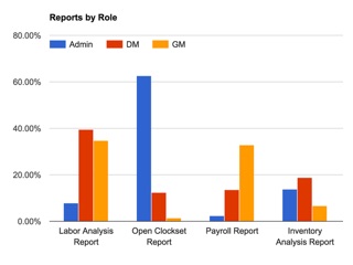
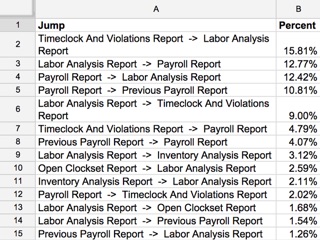
For the this phase of the project, my primary contribution was using the R statistical analysis package to analyze 3 months worth of system access logs.
Information Architecture and Flows
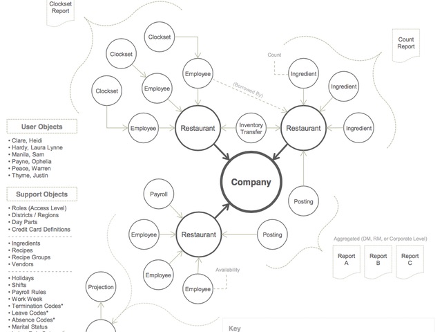
Following the research phase, we created an exhaustive list of each conceptual “object” present in the system, as well as the different actions that users would often perform using these.
From this we derived a comprehensive list of potential user workflows.
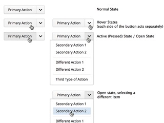
Wireframing
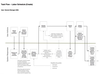
Using the flows as a basis, we were able to build wireframes depicting concepts for a real system.
Defining the Visual Appearance
With the wireframes complete, we began work on defining a new visual language with which to bring the wireframes to life (one of my key contributions to the project).
This visual language was intended not only for the redesigned restaurant management system, but also for the company’s entire range of products. Our key goals were to create a style that was modern, consistent, and subdued.
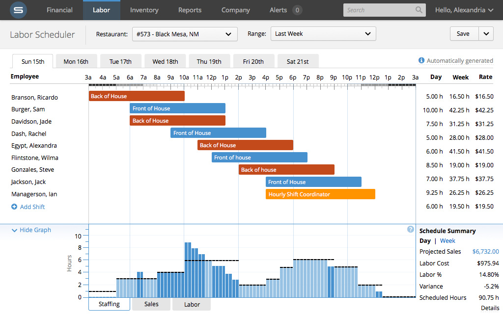
Full-Color Mockups
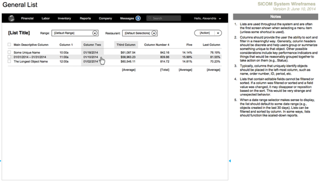
The last step of the process was to apply this visual language to several wireframes, demonstrating how it could be applied to the system in a clean, consistent way.
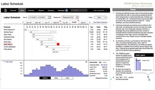
Below is a full-resolution example of one of these mockups, showing the final labor scheduler design.
Conclusions and Future Work
In the end, our team had delivered hundreds of pages of wireframes depicting a redesigned system. Aspects of the redesign are currently filtering their way into the restaurant management product and other products; the labor scheduler as pictured above was implemented in full, and with each day more components based on the design document are implemented.