Introduction
When I applied to a job at Indeed, which touts itself as “#1 job site in the world”1, you’ll never guess how I applied for it. (Spoiler alert: it was via Indeed)
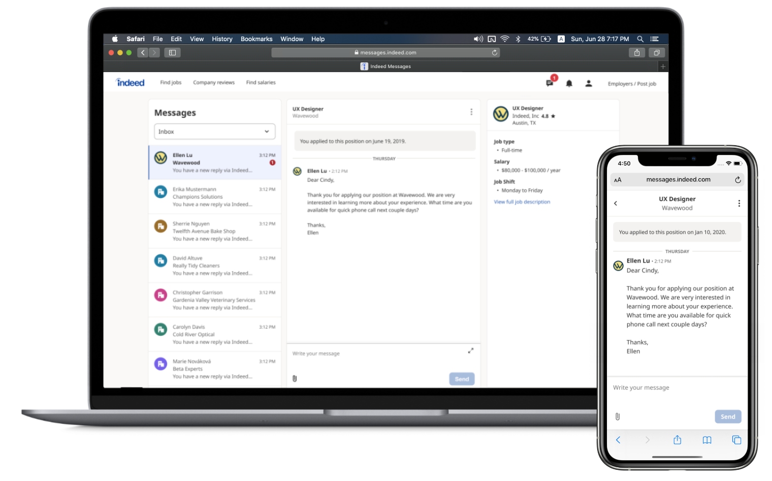
As such, I got to experience Indeed’s UX firsthand, and one of the things that stuck out to me was how not particularly good the messaging experience was. After arriving, I started asking around about it until they finally got fed up with me and just assigned me to the Messaging team so I’d stop complaining. Mission accomplished?
My Contributions
I’m not the only designer on the team, so I can’t go around taking credit for everything! Let’s focus on some projects that I worked on in particular.
Project: Spam Folder
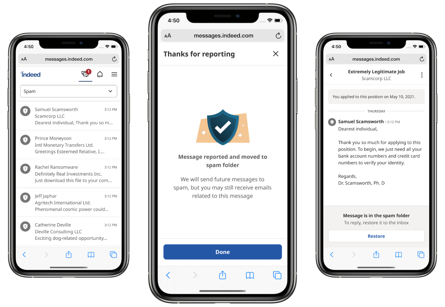
A key issue that job seekers often face is spam and scams. For example, maybe a job listing looks real but then the “recruiter” demands a job seeker’s credit card numbers. Or, maybe a job seeker just keeps getting contacted by the same recruiters over and over for irrelevant jobs. Regardless of the severity, it’s a persistent problem! As such, we felt that it would be beneficial to allow job seekers to flag and organize spam messages.
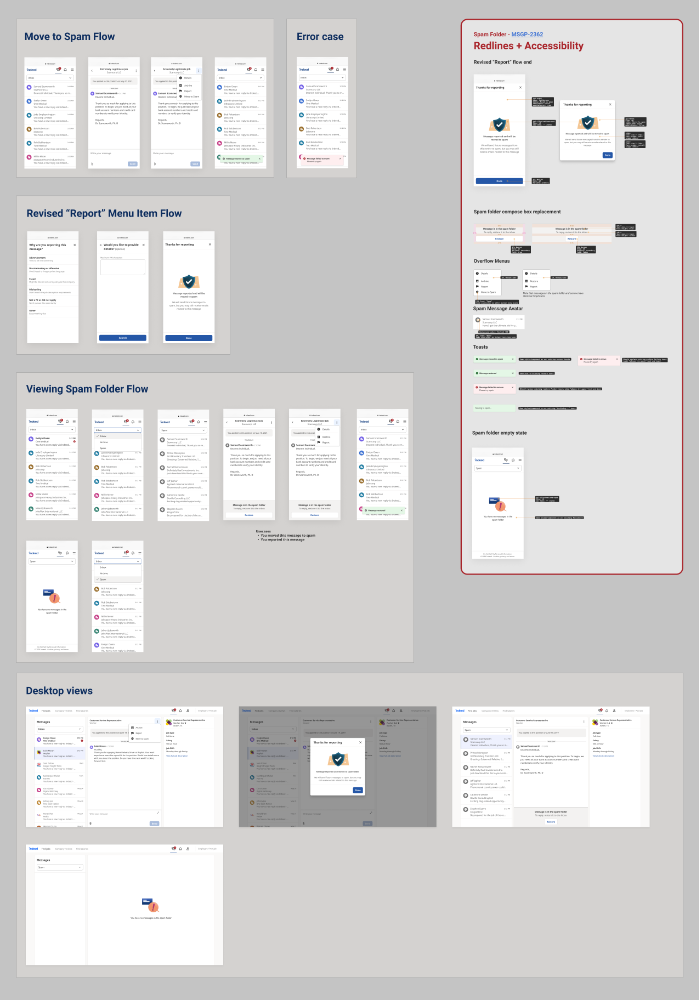
In the initial draft of the spec, the feature would simply add an additional action menu item for “Move to spam” and nothing else. However, I felt that this missed a key aspect: the fact that we also offered a “report message” option – both of those strongly relate to spammy messages, so it seemed like we were missing an opportunity if we didn’t integrate them in some way. As such, I suggested a redesign of our reporting flow as part of our spam feature, one which would also move reported messages directly to the spam folder. After all, if a user thought a message was bad enough to report, it follows that they wouldn’t want to see it again.
Moving on to the specification phase, work with the Engineering and QA teams to make changes based on feedback and identify likely edge cases prior to implementation. I also used my knowledge of frontend dev to create particularly unambiguous redlines, showing exactly which UI components to use and which parameters to feed them.
Overall, I was really excited to get to work on this project; it’s estimated that approximately 6.8 million users will use this workflow. I just hope they like it! 🤞
Project: WCAG 2.1 Compliance (Accessibility)
Recently, there has been a major push for websites to become more accessible. Web accessibility encompasses a variety of aspects of a page; for example a blind user might use a screen reader to browse the web via sound instead of vision. Or, consider a colorblind user who might have trouble distinguishing red and green elements? Many rules related to these aspects and more have been enumerated in the Web Content Accessibility Guidelines (abbreviated WCAG).
Making your site more accessible is a worthwhile goal in and of itself, but did you know that many types of web accessibility issues get you fined in Canada? 2 The legal risk is not limited to Canada, however, and recent developments in this area have led to the proliferation of a whole genre of weird “accessibility widgets” which, like some kind of ancient talisman, purport to ward off some evil force while not actually doing much of anything. Interestingly, in some cases these overlays can make things worse for users with disabilities. 3
So, if your goal is to become WCAG compliant, really the only viable option is to make your site compliant yourself (or to hire a consulting firm to do it). In my case, I worked with engineering, QA, and product to determine solutions for key accessibility issues to meet WCAG 2.1 compliance deadlines!
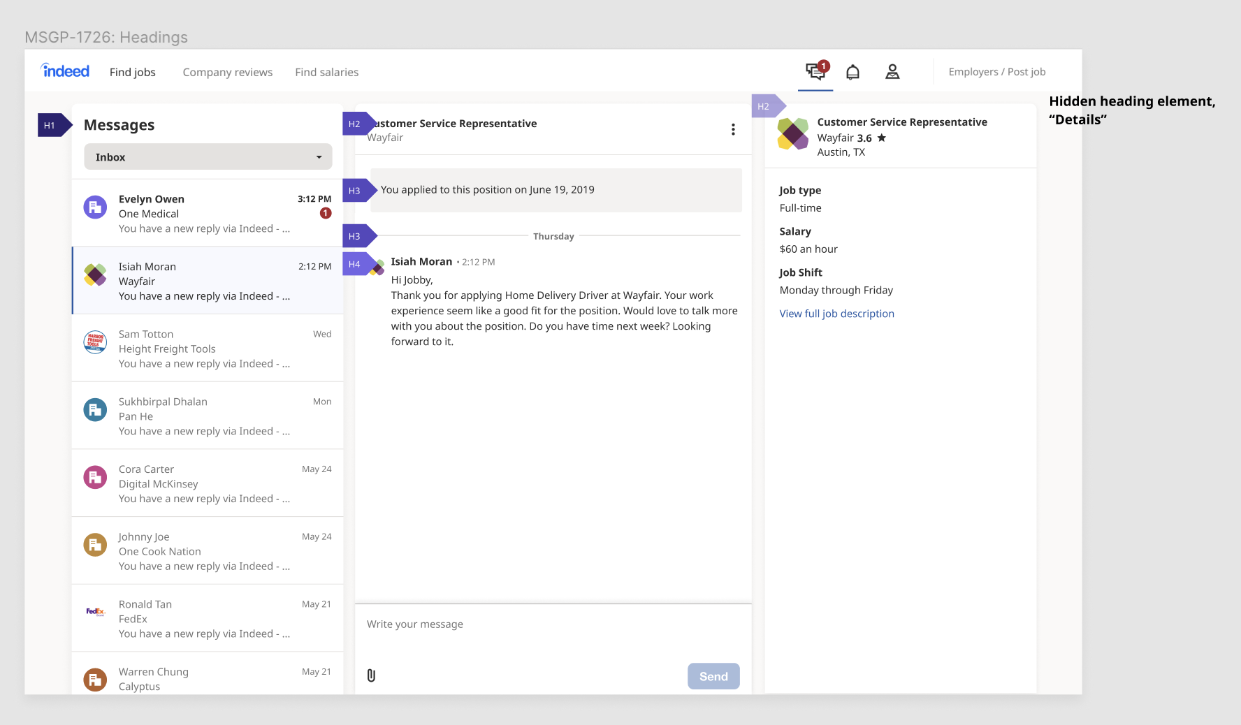
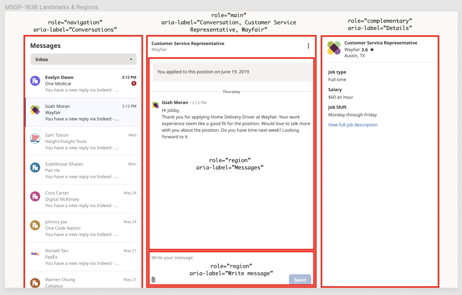
To give you an example of the kinds of things I worked on, consider these guidelines related to page structure. For users of screen readers, the extra bit of structural metadata can make navigation much smoother. I determined what the a sensible document structure would be by examining other similar applications, and created annotated images to help the engineers implement the changes.
Ultimately, we were able to fix a large amount of these issues, and hopefully users with disabilities will have an easier time using Indeed Messages!